
Ringbearer


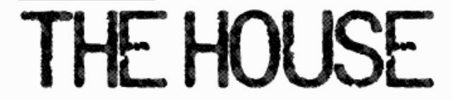


After looking at other typography in thrillers and horrors we came to the conclusion that we wanted a font with either fine, capitalised, structured serif font or bold and capitalised sans serif font. For example we either wanted a bold sans serif title with white text against plain black background with lots of negative space. Or we wanted to have a more elegant fine serif title that almost resembled the looks of a house name or door number on a house - as the title of the film is 'The House'. Therefore we want to show the references and links between he typography and what we are trying to portray. However some of the problems with some of the fonts above is some of them can tend to be too horrific and lose the thriller side of it. As the task we were originally given was a thriller genre opening to a film and not a horror genre. Therefore we are trying to get a nice mysterious title that has connotations to the two but isn't too much like a horror or a thriller.
We are still yet to discuss the ten fonts that you can see above and see which one we prefer or think is the best for our title typography and why.
No comments:
Post a Comment